Better school choice
Better school choice
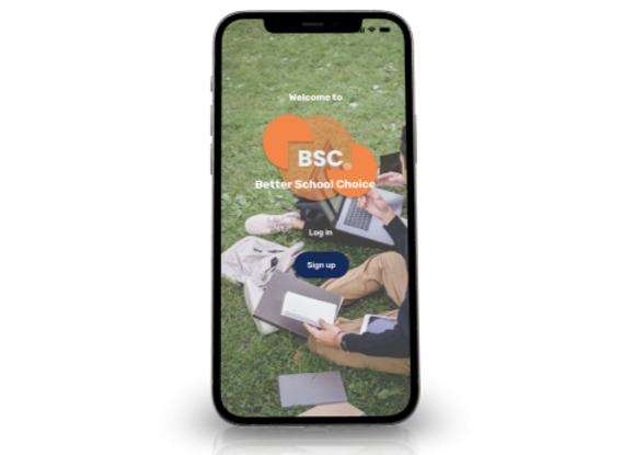
Find your Child's next school easily at your fingertips with the BSC mobile app.
I was tasked with working through the entire UX and UI process for an imaginary client looking to understand how parents decide where to send their children to school and create a solution for that group of users.
The Process:
Problem Statements:
1. Parents with full time jobs that wants to ensure their children with the best education and opportunities for success socially and academically.
2.Parents with children that needs access to information to help stream-line their decision when it comes to finding the best school fit for their children education.
Challenge:
What outcomes do I to see?
Provide users with the best information to help aid them in choosing the best education opportunity for their children. I measured this by interviews, MoSCoW and competitive analysis
How did I measure success?
At this phase of the project I conducted 6 interviews in order to get a better understanding what the users needed in a digital app.
I also conducted a MoSCoW map and a competitive analysis to get an idea of features needed and what strengths and weakness of some competitors
Interview
Quotes
“The school had everything on our checklist, but it was the location...
We ultimately went on our gut reaction.”
-Sabine Kussman


“Want a school closer to home”
-Catherine Wang
“The Classrooms in Public schools are too crowed for us”
-Morell Family
.png)
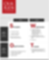
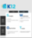
Competitive Analysis I conducted a comparative analysis of five social platforms to identify their respective strengths, weaknesses, and opportunities. By conducting this analysis, I aimed to identify areas where StudioHop app could make a meaningful impact in the market.

Personas
I wanted to form a deeper understanding of our users' goals, needs, experiences, and behaviors. I created 3 personas for each of the user segments. These were based on the interviews. I used these personas to gain insight to solve the problems of the users.
.png)
Testing
With the insight from the research I created a low fidelity wireframe. I Tested the Low Fidelity usability test.
Why? wanted to tested the users navigation flow and the abilities to complete a few tasks.
.png)
.png)

.png)
Analysis
1.Users focused on their gut feelings.
2.communication preferences:
Value clear and direct communication from schools
Appreciate personalized attention and tours
Respond well to data-driven information and statistics about school performance and outcomes
3.Decision-making:
Place a high priority on their child's education
Will take the time to thoroughly research and visit multiple schools before making a decision
Consider both the academic and cultural fit for their child when choosing a school.
4. User task completion was 100%
5. Easy to navigate
6. Get rid of the file icon on the navigation bar.
Style & Design


Color Platte
icons
buttons

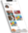
The Product
.png)


.png)
Our product provides an easy and convenient way for parents to search and compare schools in their area. We have detailed and up to date information on school programs, amenities, and tuition fees, parents can make informed decisions about their child's education. Our product also offers real-time updates on school admission status and available spots, helping parents secure a spot for their child in their preferred school.
_edited_edited.png)
Take A ways
1.The High fidelity was a good ending for a new start.
2.Users completed all tasks and thought app was very user friendly.
3.Would like more time to work on finalizing more screen and features to make the user experience more smoother.
Next steps
-
Take a way the animation feature on the navigation bar.
-
Add more screens
-
Add a virtual touring features for those school that afford it for online visits
-
Work on the Visit screen more. Look at the calendar interaction more in detail.